Dreams For Schools
We developed a web application for Dreams For Schools to streamline the instructor assignment process, saving them 30+ hours each recruitment season.
Duration
Jan 2022 - July 2022
(7 months)
Role
UX/UI Designer,
Front-end Engineer
Tools Used
Figma, React, Github,
Google Cloud, Heroku
Project Context
About Dreams For Schools
Dreams For Schools (DFS) is a nonprofit that partners with K-12 schools to host after school programs that teach students about STEAM subjects (science, technology, engineering, arts, and math).
About My Role
I worked alongside 4 other engineers on this project. As the sole UX/UI designer, I created personas, user journey maps, designed the information architecture as well as the wireframes and prototypes. I also used React to develop some of the features.
Problem Statement
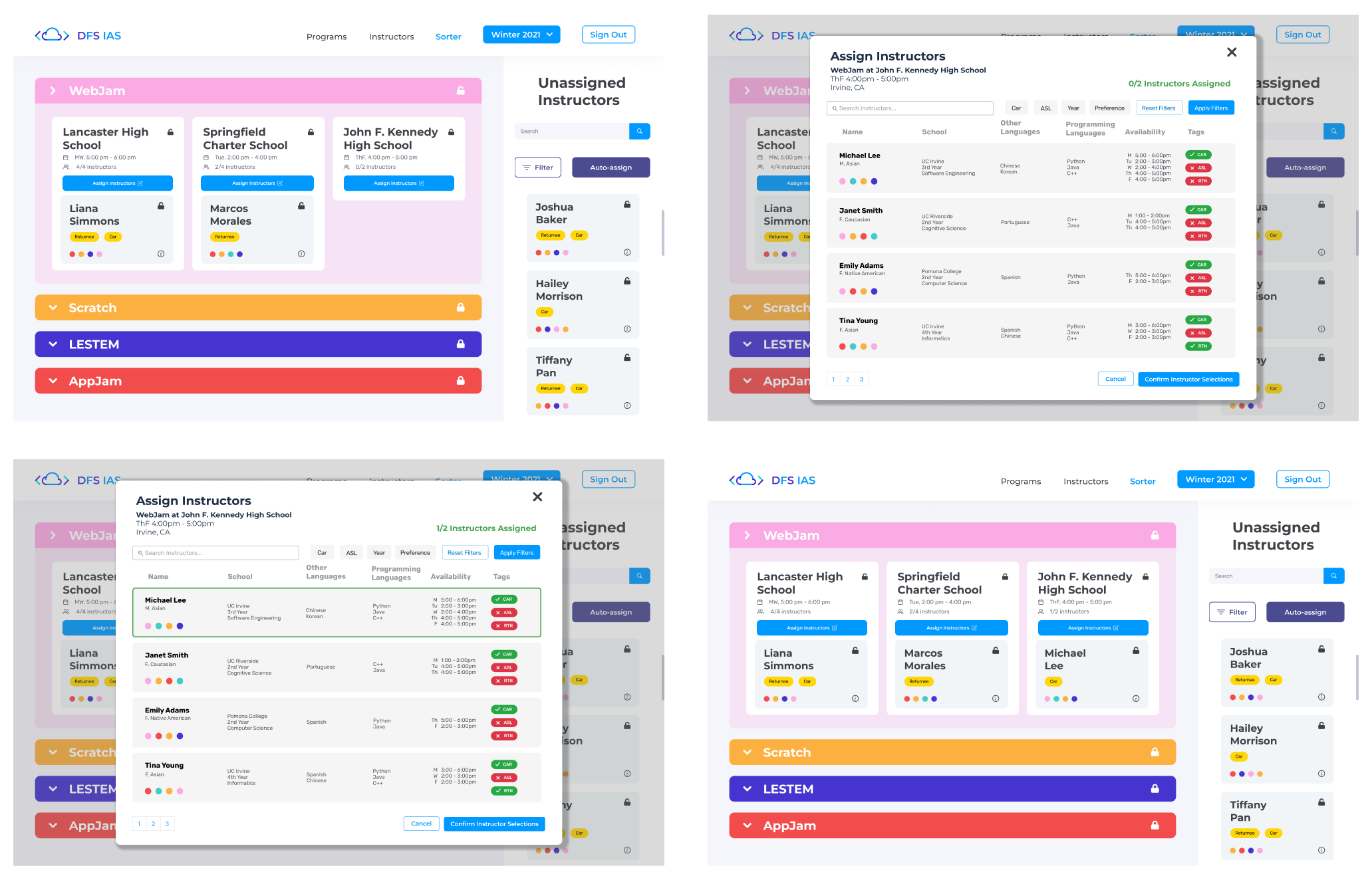
When scheduling instructors to teach classes, a variety of information is taken into consideration, including instructor availability, preferences, experience, and more. Dreams For Schools currently lacks the tools necessary to assign instructors based on this information.
As a solution, we developed an instructor assignment tool with improved data visualization, where Dreams For Schools can streamline their instructor assignment process.
User Research
Understanding Pain Points
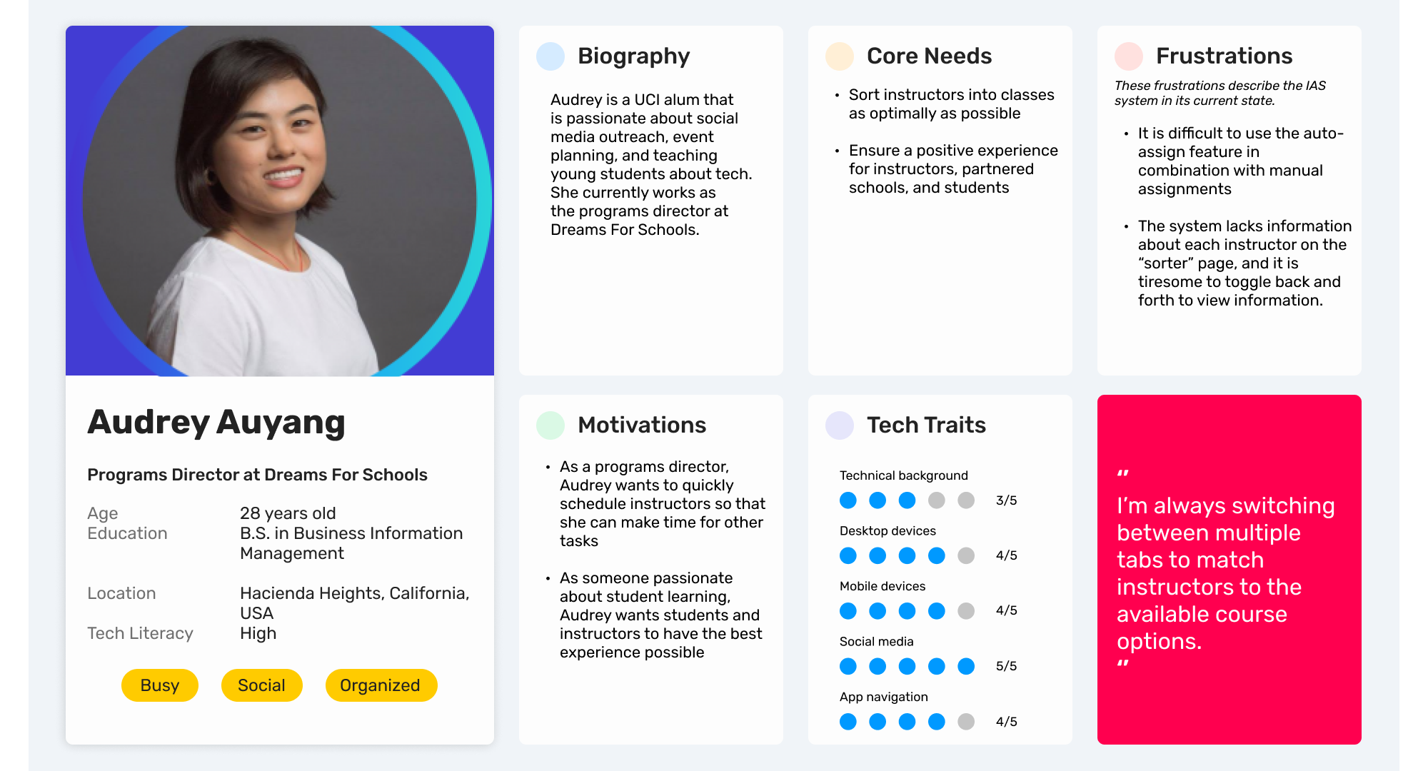
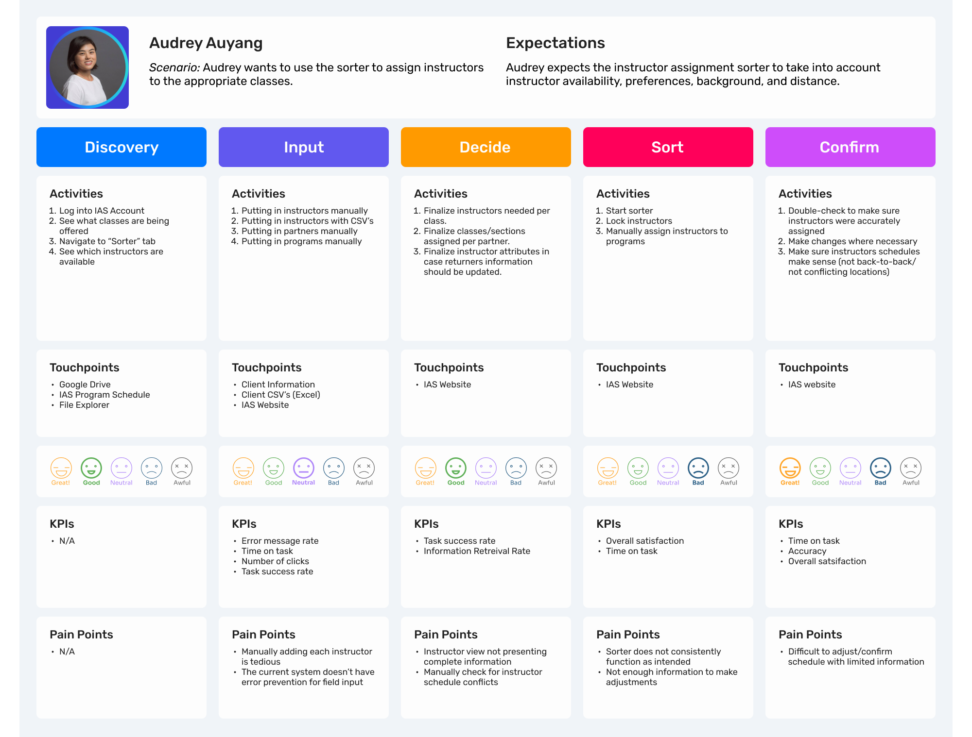
As an internal scheduling tool, the primary audience for this system is the DFS admin team. In order to gain a deeper understanding of their current approach to instructor assignment, we interviewed the programs director to identify pain points. We utilized this data to create a persona and a customer journey map.
Working in Agile
Following agile methodology, we worked in two-week sprints.
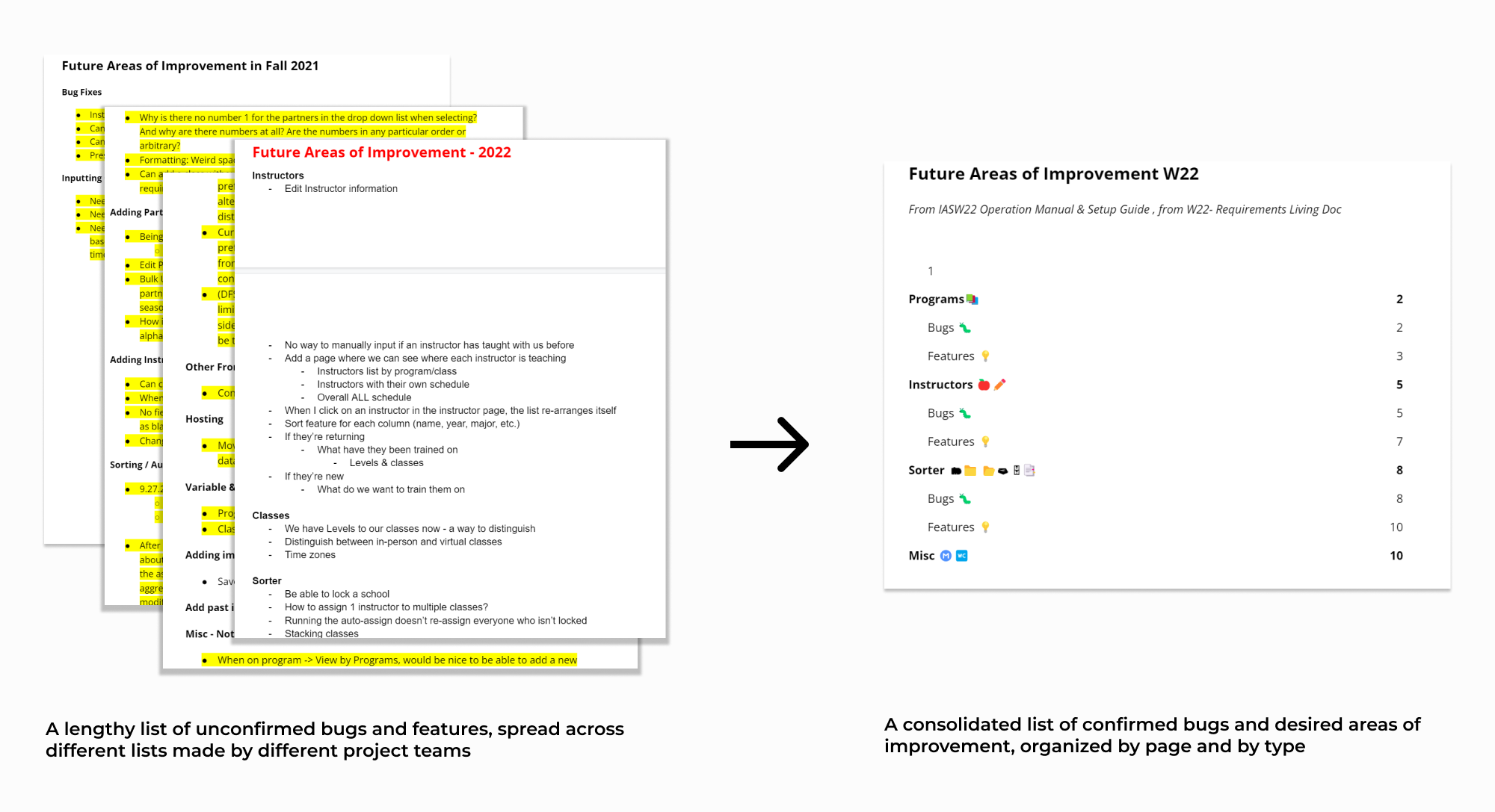
To organize our workflow, we consolidated the list of requirements by organizing tasks by type,
then assigning priorities to each task in a projected schedule. The sprints allowed us to work
iteratively on the product and remain flexible during the process.
Communication played a major role in agile development. To set clear expectations between
us and Dreams For Schools, we held weekly meetings as well as asynchronous communication
via Slack for pressing clarification questions. This allowed us to be transparent
about our progress, communicate issues and needs, and facilitate teamwork.
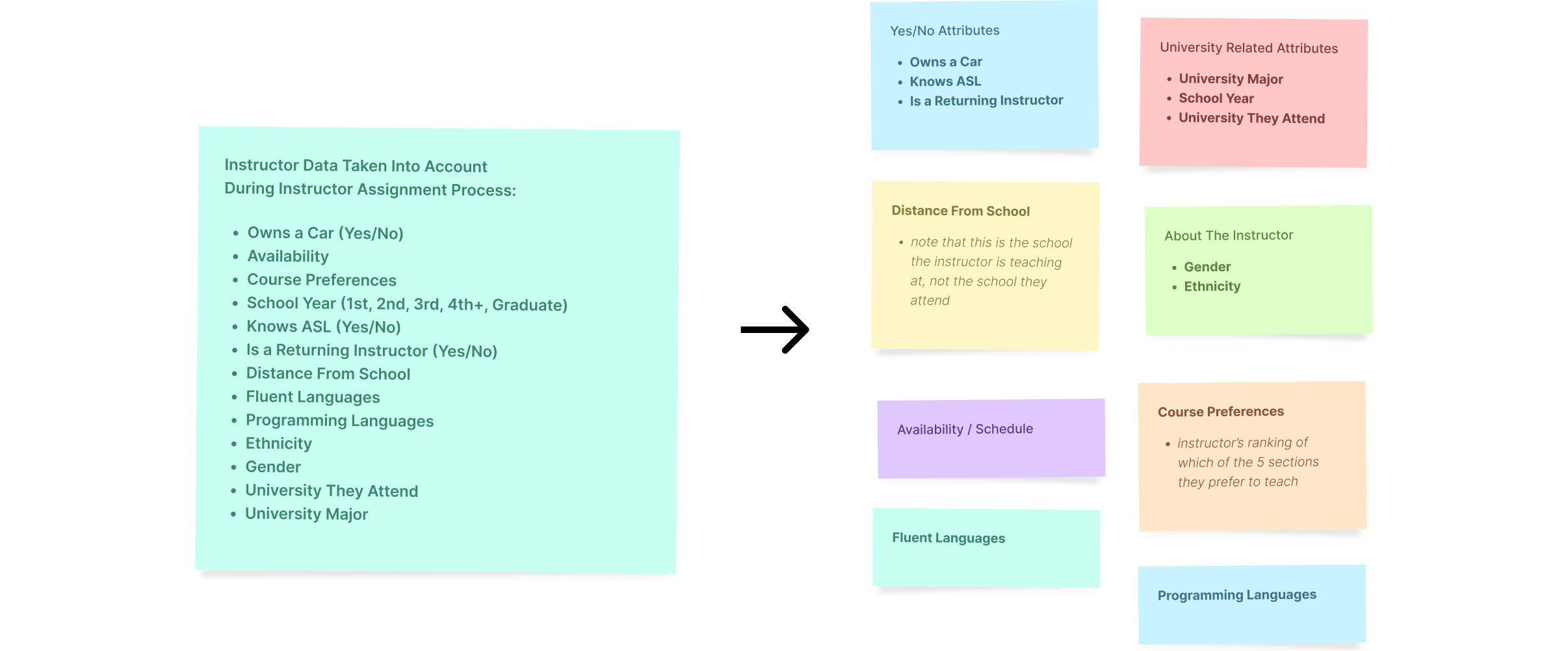
Information Architecture
During the user interview, we learned about the long list of factors taken into consideration when assigning an instructor. This was a lot to keep track of for the programs director, so our goal was to find a way to organize all the information about each instructor. We started by grouping various pieces of data together, eventually forming different "categories" of information.
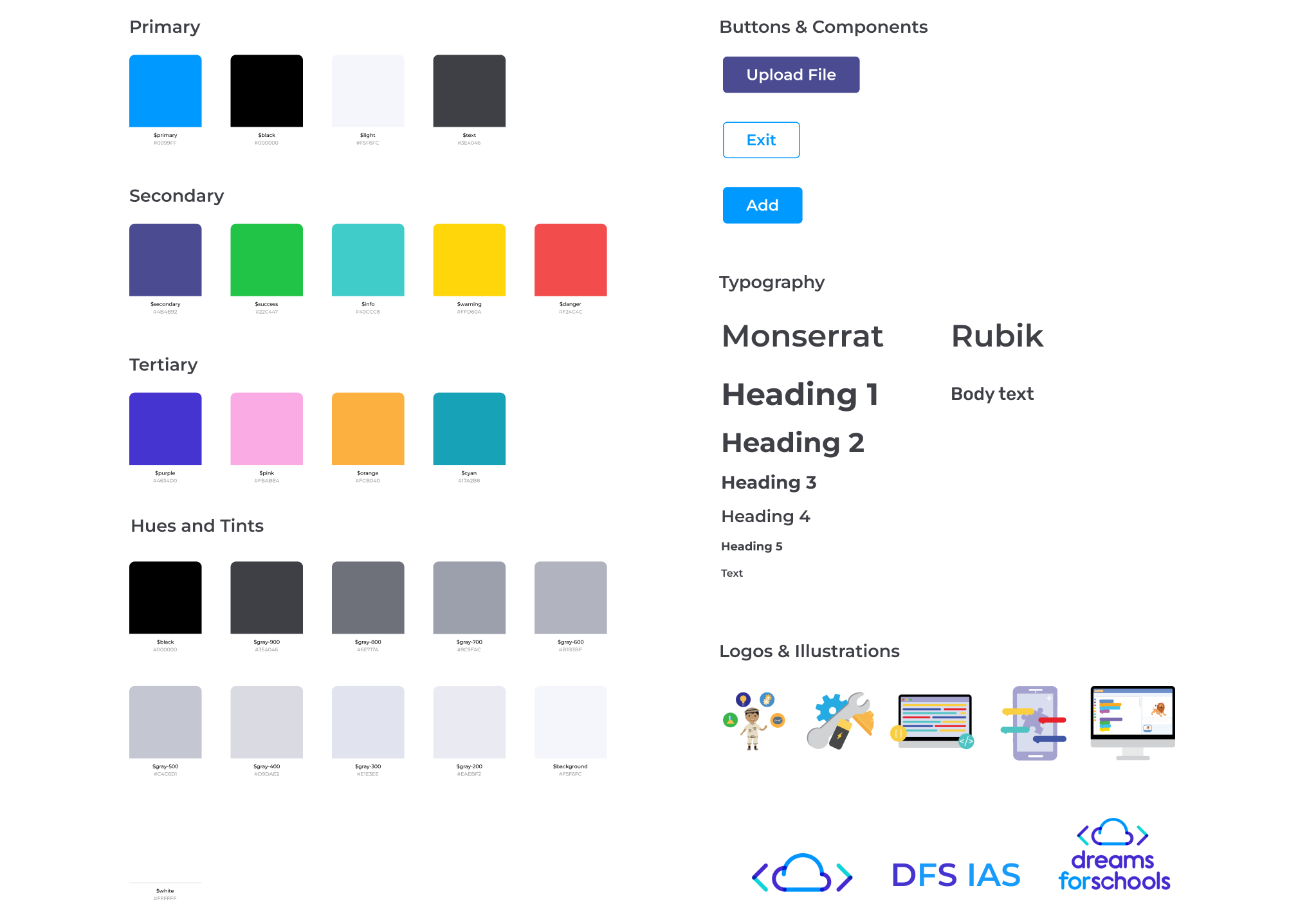
Design System
We utilized a design system to ensure consistency in the designs. The colors reflected the Dreams For Schools branding and were intended to be fun, contrasting but playful. The DFS admin team already associated certain colors with courses in their mental models, so we used this to our advantage in the design to differentiate between class types and instructor course preferences.
Initial Design
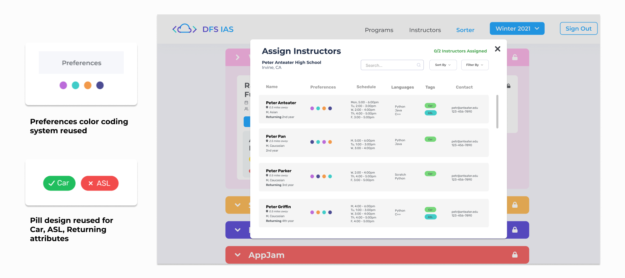
Reusing Design Components
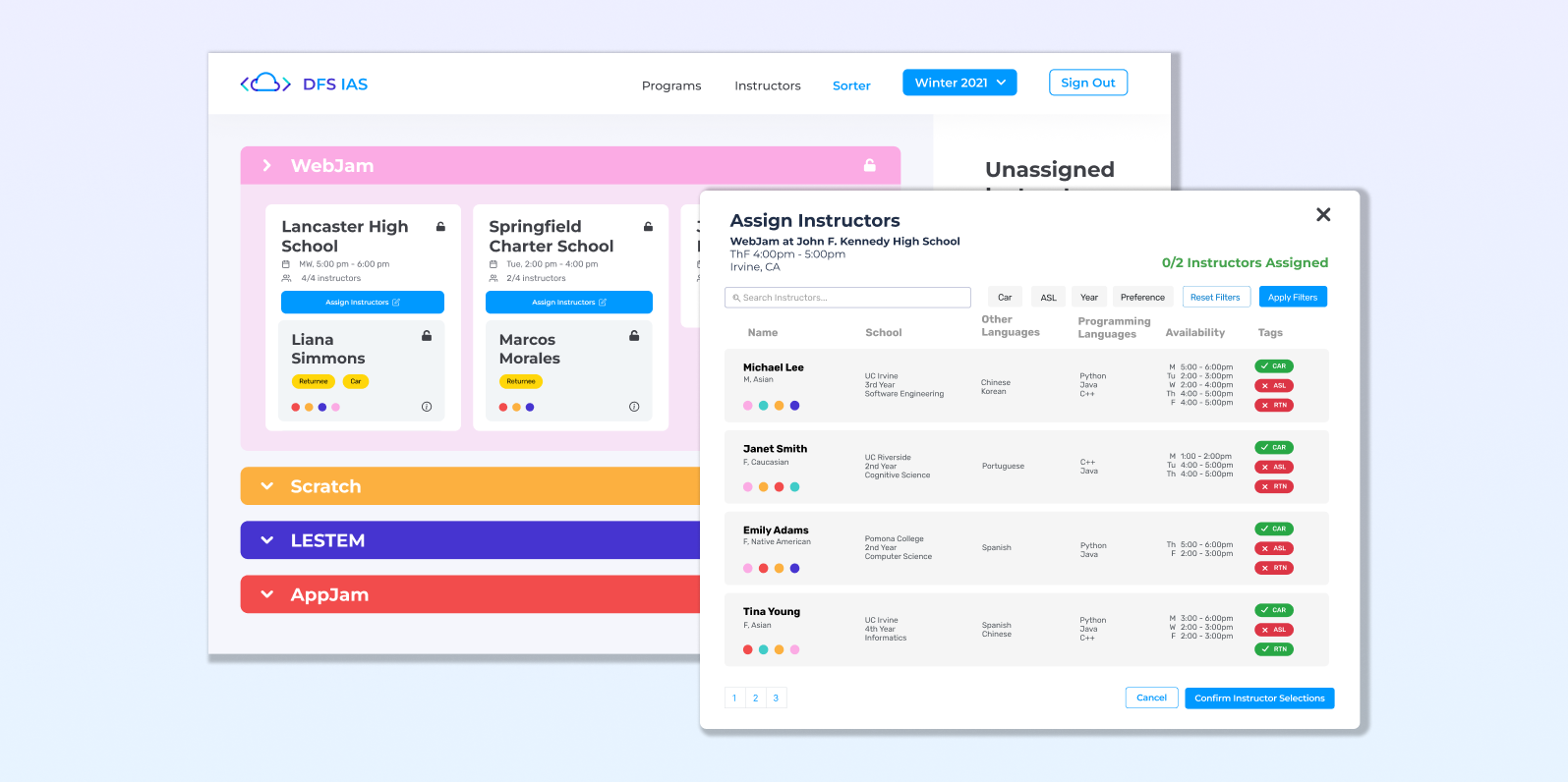
Doubling as a front-end engineer, I took a different approach to the design process. The information we were visualizing was already represented in other parts of the system, so it was important that we utilized existing components to 1) save development time and 2) stay consistent with user expectations.
Final Design
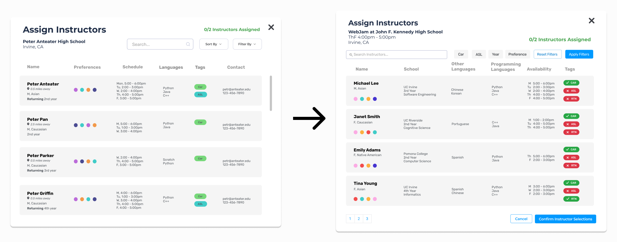
By working with the DFS admins to iteratively refine the designs , we reached a consensus on a design concept. The tag colors were made red and green so their meanings could be easily discerned. We also made improvements to the filtering feature, making each attribute accessible in less clicks. This final design would allow the users to easily identify all the necessary information about instructors to make the best assignment possible.
Implementation
Learning & Using React
Implementing the features on this instructor assignment modal was both challenging and rewarding for me, as it was my first time using React. My team worked on parts of the system in partnered pairs, so my partner and I implemented the search and filter features on this page. By studying the codebase and understanding how data was stored in the backend, we were able to successfully implement the modal.
What I Learned...
Design within real world constraints
When my team took on this project, parts of the application were already in place. This meant that my design process didn’t start with a blank slate like some of my previous experiences. Instead, I built upon an existing interface that needed improvements to accommodate new requirements. This taught me to be comfortable working within existing limitations.
Communicate often and clearly
This project was my first time working within an agile framework. It quickly changed how I thought about communication. We conducted frequent team check-ins, sprint retrospectives, and weekly reviews with our nonprofit stakeholders. Some conversations were detailed and tactical. Others were about alignment and tradeoffs. In each case, I had to translate design work into clear, accessible language for non-technical partners while staying closely aligned with my team on priorities and execution. I learned to refine my message for different audiences and to embrace iteration as part of the process.