OC Habitats
We designed a form manager for OC Habitats to effectively capture habitat preservation data, so they can easily spot patterns and make informed decisions.
Duration
Oct 2021 - June 2022
(9 months)
Role
UX/UI Designer
Tools Used
Figma, Slack, Zoom
Project Context
About OC Habitats
OC Habitats (OCH) is an organization with a mission to conserve, rehabilitate, and restore habitats in the Orange County area. One way they do this is via “habitat monitoring”, where they assign volunteers to survey beach segments for shorebirds on the coast.
About My Role
As a part of the OCH team, I executed end-to-end design solutions, including user research, wireframing, design system maintenance, user testing and client communication. This project was done as a part of Commit The Change, a UCI organization that partners with nonprofits to create high quality software.
Problem Statement
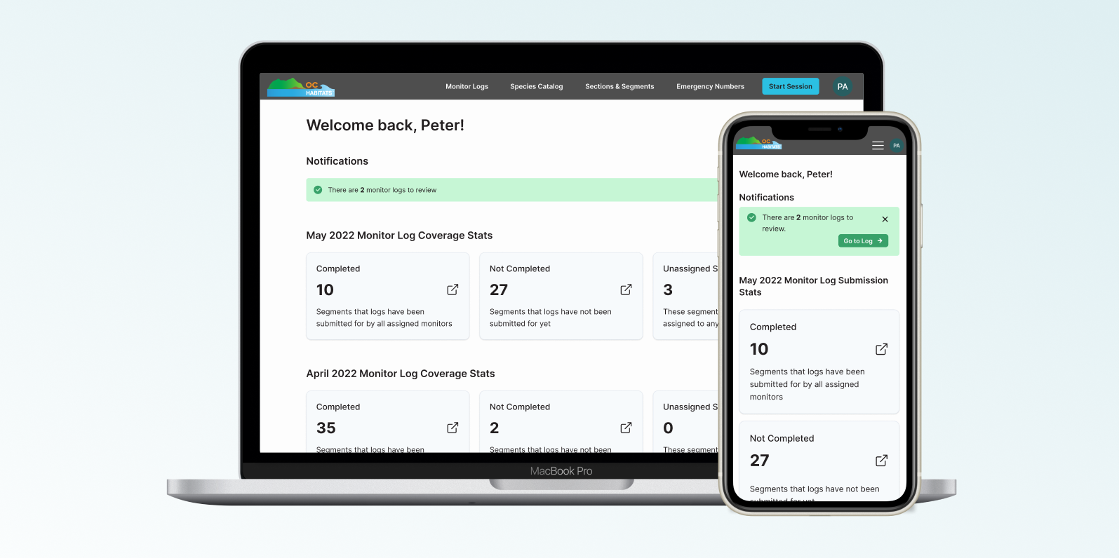
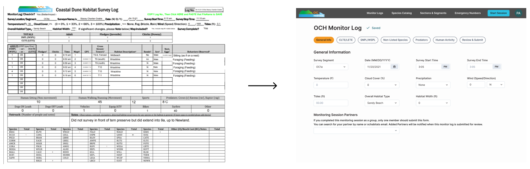
OCH currently uses paper forms, or “monitor logs”, for their volunteers to record data about the local habitat. With 40+ logs per month, it is difficult to record and analyze information.
To solve this problem, we created a form manager for OCH admins and volunteers to effectively capture habitat preservation data.
User Interviews
Users: Admins and Volunteers
The users of this platform include the OCH admins, who manage volunteers and the data they log, and volunteers, who input the data. However, the form manager feature would be utilized by admins only. We interviewed them to learn more about their current workflow for better system design.
Key Findings
- All survey locations utilized the same monitor log template
- The questions on the template are updated on a need-basis
- OCH admins described themselves to have medium tech literacy
- Users will access the platform on both desktop and (occasionally) mobile devices
- Monitor log questions ask for a variety of data types
Information Architecture
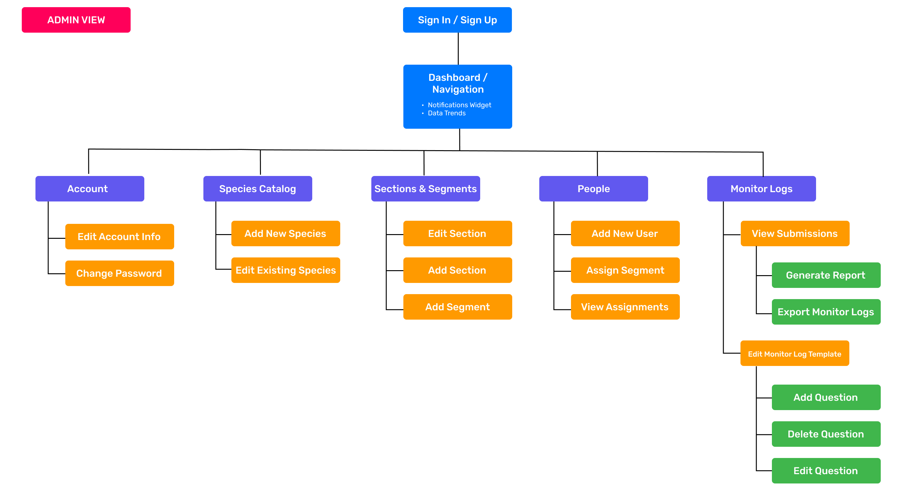
Creating A Site Map
We started the ideation process with a site map to visualize the layout of the entire system. It was important to us to define its structure, understand the role of each page and how the features should be organized. As a designer on this team, I oversaw the "Edit Monitor Log" and the "Species Catalog" feature sets.
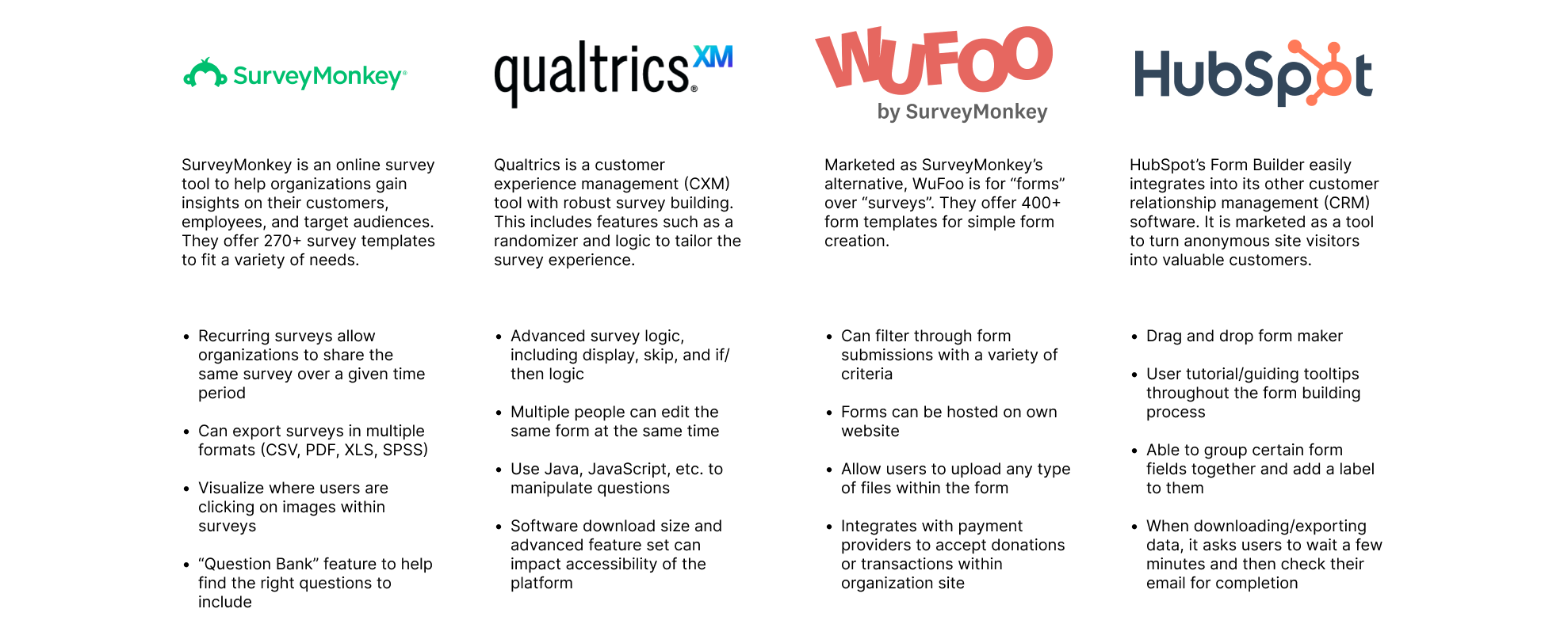
Competitive Analysis
With focus on the form editing feature, my team and I conducted a competitive analysis off other similar products on the market. We tested each product's form building process, allowing us to better understand how we can tailor this experience for OC Habitats.
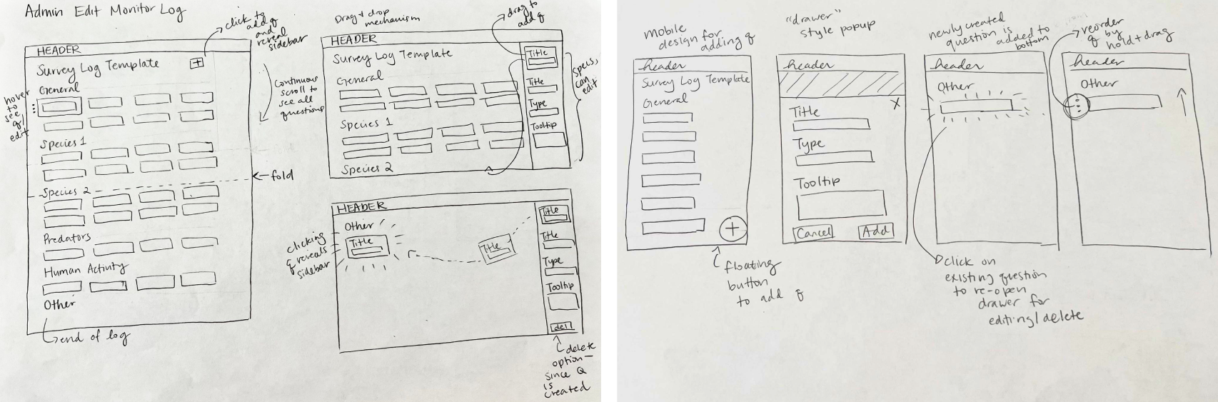
Initial Ideation
"Edit Monitor Log Template" Features
We created various sketches of the pages on both desktop and mobile. Below are the sketches we created for the "Edit Monitor Log" page. Even though this particular feature will primarily be used on desktop, it was important for us to consider both formats early in the design process.
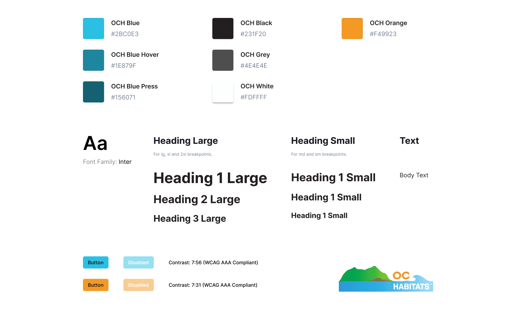
Style Guide
We created a style guide to make sure that there was consistency across designs, and that the organization's branding was accurately reflected within the internal system. We also utilized Chakra UI and Feather icons. These translated into a design system, which we maintained for our Figma project.
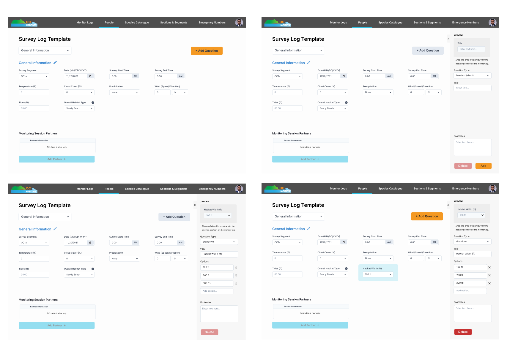
High Fidelity
(1st Iteration)
My team decided on the fixed sidebar design during early ideation so that each question could be selected and viewed with ease. In mobile, this translated into a pop-up design. Drag and drop was utilized in both views to reorder questions and drag newly created questions into the desired position.
User Testing
Remote Usability Testing
After the first iteration of hi-fi was completed, we put our designs to the test.
My team recruited OCH admins and volunteers to observe how successfully users performed tasks, such as
assigning volunteers, filling out the log, editing the template, etc.
The remote user tests were conducted via Zoom, using either desktop or mobile iterations
of the prototypes. We conducted 20 usability sessions in total.
Analyzing User Feedback
Feedback from usability testing gave us great insight into our designs. The admins noted that drag and drop felt unintuitive, and that previewing the question in the sidebar felt unnecessary. At this point, the scope of the feature was also updated: not all questions need a delete option, and only 2 question types would ever be added: text or number input.
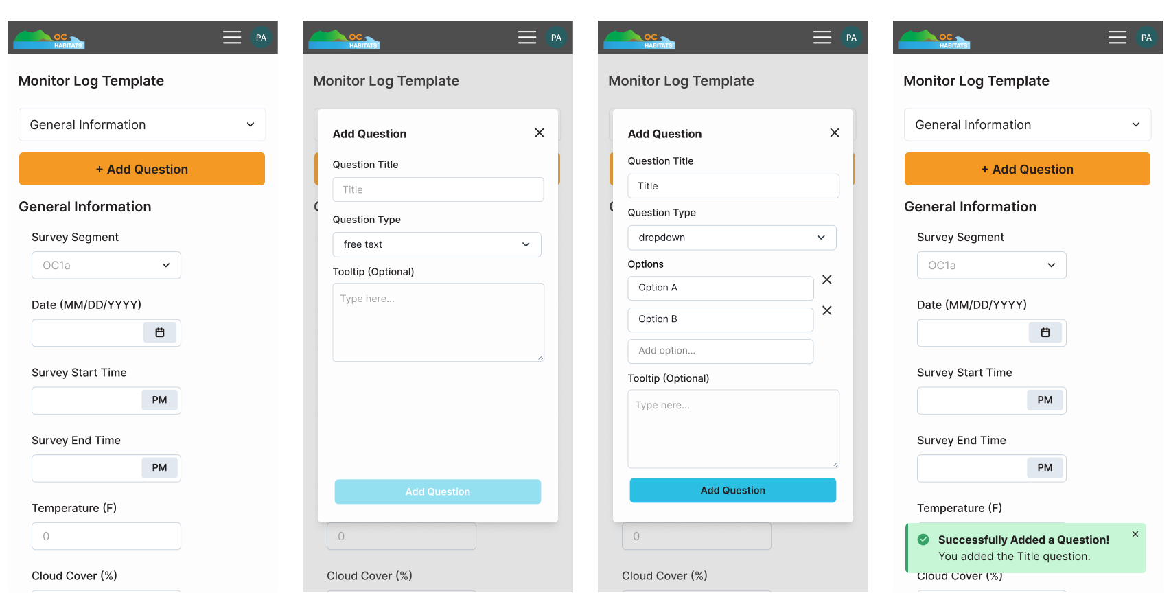
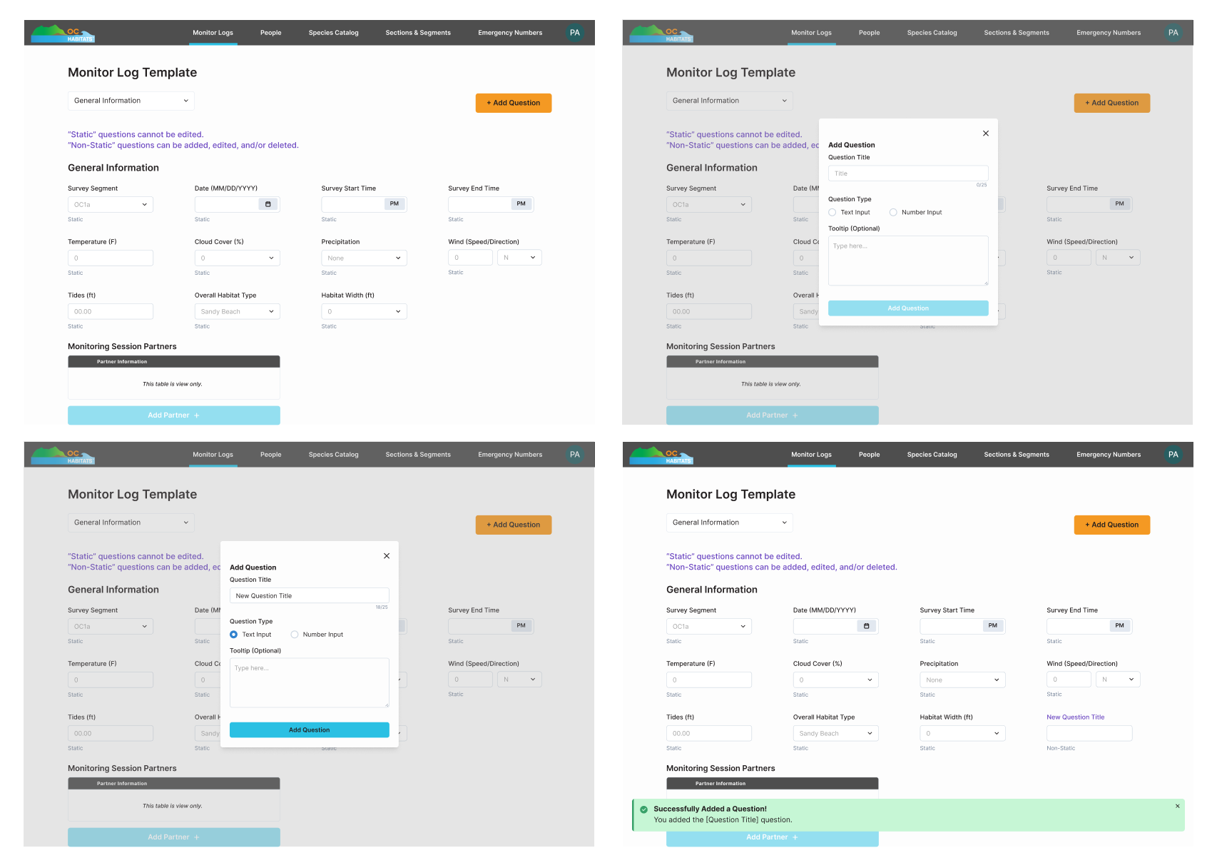
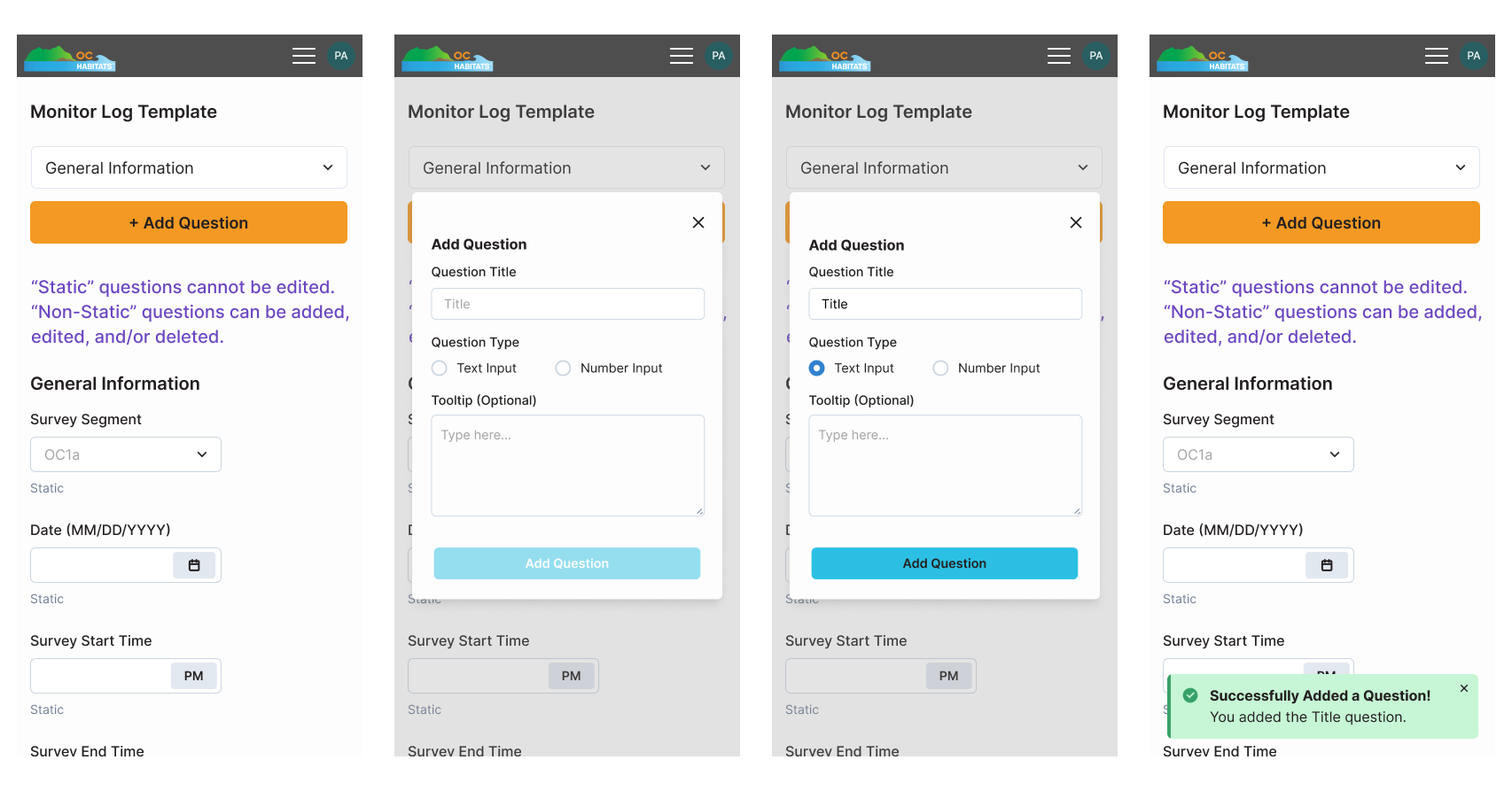
Final Design
We tweaked the design to incorporate the user feedback. Users could click "+ Add Question"
to add a new one, click on existing questions to edit/delete
it, and drag questions around to re-order them. Questions that could not be modified were also labeled as
"static" question types for clarity.
We utilized a popup design to
make the design more consistent with mobile view. It would also allow for the developers to reuse components, thus
saving development time.
What I Learned...
Adapt and iterate
Our team ended up with less time than planned to implement
this feature (because when doesn’t that happen, right?
Inclusive design in context
Designing this product meant thinking about more than just screens. Our users will be outdoors or sitting in cars, entering data they might have first logged on paper. We considered legible typography in bright sunlight, clear touch targets for users interacting with gloves, and logical flows that made the interface easy to follow. I also focused on consistent feedback and error prevention (because having to correct data you already inputted is frustrating!). Through this project, I learned how to apply WCAG principles in practice while also thinking about real users in the actual contexts.